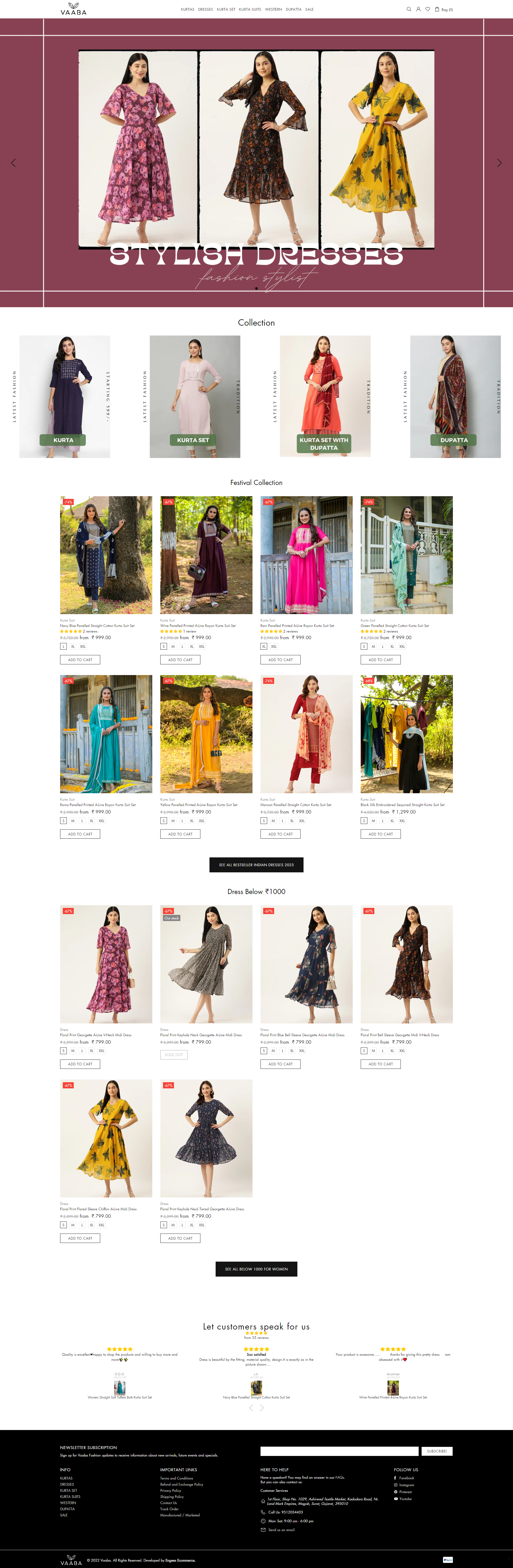


A refined presence in women’s fashion.
A Surat-based brand, Vaaba features women’s ethnic and western apparel, blending tradition and culture with quiet sophistication. Clarity, consistency, and consumer confidence are the brand’s foundational principles. They cater to an audience of women looking for everyday clothing that is timeless in its designs and wearability.Client Brief
The brief was brief and clear, for a brand that sells women’s apparel, the logo needed to make its place in the competitive market. The clients’ had three main requirements, minimalism, that it should have ‘v’ in it, and must be very versatil for platforms and applications.Typography
The brand name "Vaaba" features clean, modern typography with carefully balanced letterforms that ensure excellent readability across all sizes and applications.Icon Design
The logo is a simple and true representation of the brand’s principles. A ‘v’ nestled between two leaves that speaks to both growth, clarity and natural everyday beauty.Symbolism
Leaves or nature generally symbolize growth, freshness, and natural beauty, qualities that resonate with women who choose Vaaba for their wardrobe needs. The 'V' represents value, and the brand name itself, creating a meaningful connection between form and function.Versatility Features
The minimalist design ensures the logo works seamlessly across all applications - from tiny social media profile pictures to large storefront signage, maintaining clarity and impact at every scale.Color Palette
A sophisticated sage green for the leaves paired with deep charcoal for the 'V' creates an earthy yet elegant aesthetic that appeals to conscious consumers while remaining timeless and professional.Impression
The logo exudes organic sophistication and mindful design, positioning Vaaba as a brand that understands the modern woman's desire for both style and substance in her fashion choices.