Four Pillars Media agency | Sapna Land Logo Design
About the Client:
As a real estate firm, Sapna Land Corporation specializes in the purchase and subdivision of land. Their main line of business is buying huge amounts of land and selling it in smaller lots to suit the demands of individual buyers. They are committed to helping customers locate the ideal plot of property that meets their unique needs.
Client Brief:
Sapna Land Corporation is in search of a logo that mirrors their expertise in land transactions. They are keen on a design that effectively communicates their pivotal role in both buying and selling land while radiating professionalism, reliability, and creativity.
Our Vision & Logo Description:
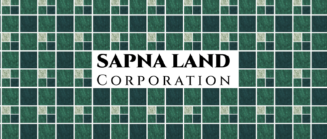
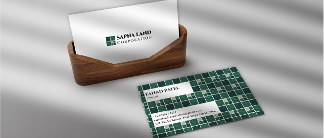
In line with Sapna Land Corporation's requirements, our logo design is centered around a square divided into four equal parts. The three larger squares represent the company's process of acquiring land in bulk, while the fourth square, subdivided into smaller squares, symbolizes the subsequent subdivision process for sale.
This design is a demonstration of our creative design execution as well as the company's fundamental business concept. The logo's vivid green color scheme represents development, the natural world, and the unrealized potential of Sapna Land Corporation's land offerings.


