Logo Design for Real Estate - Chinatamani
About the Client:
Chinatamani, established in 2015 and based in Surat, operates across various sectors, including finance and real estate. As the parent company of a group of companies, Chinatamani has embodied reliability, growth, and diversification since its establishment.
Client Brief:
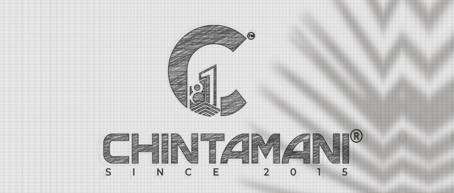
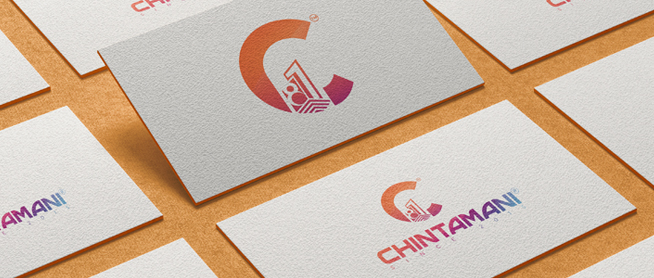
Chinatamani seeks a unique real estate logo design that reflects its identity and longevity in the business world. They envision a logo beginning with the letter "C" and incorporating the number "81". The logo should feature gradient colors to convey a sense of modernity and dynamism.
Our Vision & Logo Description:
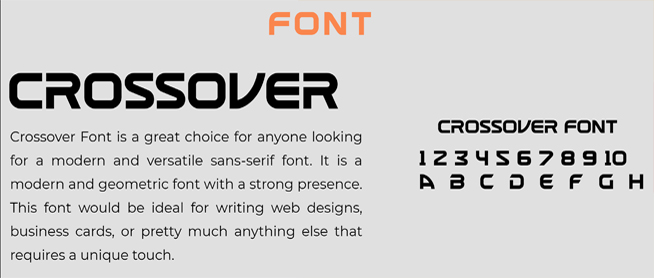
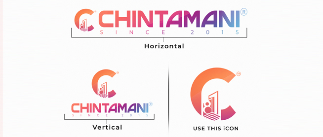
In response to the client's brief, our vision for the Chinatamani logo is to create a design that signifies strength, growth, and continuity. The logo starts with the letter "C," representing the company's name, and integrates the number "81" seamlessly. A gradient color scheme is employed to evoke a sense of progress and innovation. The typography is modern and bold, enhancing the overall impact of the logo. Overall, the logo reflects Chinatamani's commitment to excellence and its position as a leading entity in the business landscape.
Collaborating with Four Pillars Media Agency, the best digital marketing agency in Surat, we have crafted a logo design that captures the essence of Chinatamani's identity and resonates with its audience. As experts in logo designing, we are committed to delivering creative solutions that elevate brands and leave a lasting impression.
