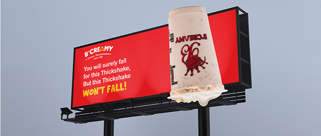
B'creamy Logo Designing by Four Pillars Media Agency
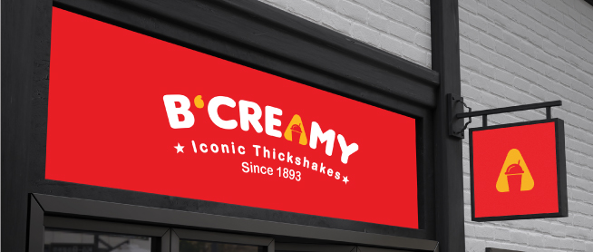
B'creamy is an iconic dessert chain based in Surat, India, renowned for its thickshakes, falooda, ice cream, juices, and more. With a commitment to quality and innovation, B'creamy has served over 10 million smiles across its 60+ outlets. It has been recognized as Surat's top dessert chain, winning prestigious awards for its delectable offerings. Client Brief: B'creamy desires a logo that encapsulates its essence as a leading dessert destination while symbolizing its commitment to quality and customer satisfaction. The client specifically requested the incorporation of a glass motif, representing its diverse range of beverages and desserts. Our Vision & Logo Description: Our vision for B'creamy's logo was to create a visually appealing and instantly recognizable symbol that communicates the brand's core values of indulgence, quality, and variety. Logo Description:- Typography: The brand name "B'creamy" is prominently featured in bold, modern typography, signifying confidence and modernity.
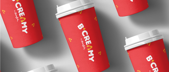
- Icon: The letter 'a' in "creamy" is replaced with a stylized glass icon, representing the brand's extensive beverage offerings. The glass is depicted in vibrant yellow, symbolizing energy, joy, and warmth.
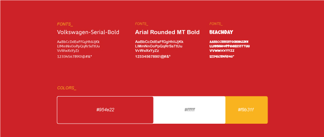
- Color Scheme: The logo utilizes a combination of red and yellow hues. Red conveys passion, excitement, and indulgence, while yellow represents happiness, positivity, and creativity.
- Impression: The logo exudes a sense of vibrancy, fun, and deliciousness, inviting customers to experience the joy of B'creamy's delightful treats.


